

1. 플렉스 박스 레이아웃 flex box lay-out 에서 사용하는 용어
📌 플렉스 박스 레이아웃은 그리드 레이아웃을 기본으로 하고 각 박스를 원하는 위치에 따라 배치
📌 여유 공간이 생길 경우 너비나 높이를 적절하게 늘이거나 줄일 수 있다

① 플렉스 컨테이너 (부모 박스) : 플렉스 박스 레이아웃을 적용할 대상을 묶는 요소
② 플렉스 항목 (자식 박스) : 플렉스 박스 레이아웃을 적용할 대상으로 위 이미지의 'flex item' 모두 해당
③ 주축(main axis) : 플렉스 컨테이너 안에서 플렉스 항목을 배치하는 기본 방향 (왼쪽 ➡️ 오른쪽)
플렉스 항목의 배치가 시작되는 위치를 '주축 시작점', 끝나는 위치를 '주축 끝점'
④ 교차축(cross axis) : 주축과 교차하는 방향 (위 ➡️ 아래)
플렉스 항목의 배치가 시작되는 위치를 '교차축 시작점', 끝나는 위치를 '교차축 끝점'
2. 플렉스 박스 항목을 배치하는 속성
| 종류 | 설명 |
| justify-content | 주축 방향의 정렬 방법 |
| align-self | 교차축에 있는 개별 항목의 정렬 방법 |
| align-content | 교차축에서 여러 줄로 표시된 항목의 정렬 방법 |
| align-items | 자식 요소가 1개이거나 줄 바꿈이 필요없을 때 |
1) display 속성
flex : 부모요소는 블록 속성을 유지하면서 자식 요소에 flex 환경설정.
inline-flex : 부모요소는 인라인 속성으로 변경하면서 자식 요소에 flex 환경설정.
▶️ 플렉스 박스를 인라인 레벨 요소로 정의.
💡 배치할 요소에 속성을 지정하는 것이 아닌 부모 요소에 속성을 지정
💡 inline 요소도 flex 적용 하면 너비와 높이를 가짐
<head>
    <style>
        * {
            margin: 0;
            padding: 0;
        }

        main {
            width: 100%;
            height: 100vh; /* vh : Vertical Height. 화면 기준 높이 */
            background: #eaeaea;
        }

        section {
            border: 10px solid pink;
        }

        section article {
            width: 100px;
            height: 100px;
            background: #b6b2b2;
            border: 1px solid #b6b2b2;
        }

        section article {
            /* float: left; */
        }

        section article {
            /* display: inline-block */
        }
        section {
            /* display: flex; */
            display: inline-flex; /* 부모 요소인 section을 인라인 속성으로 바꾸기 */
        }

    </style>
</head>
<body>
    <main>
        <section>
            <article></article>
            <article></article>
            <article></article>
            <article></article>
            <article></article>
        </section>
    </main>
</body>


2) flex-direction 속성
🥑 플렉스 항목을 배치하는 주축과 방향을 지정하는 속성
flex-direction : row - flex의 기본축을 가로로 지정
▶️ 주축을 가로로, 교차축을 세로로 지정 <기본값> / 왼쪽에서 오른쪽
flex-direction : column - flex의 기본축을 세로로 지정
▶️ 주축을 세로로 교차축을 가로로 지정 / 위에서 아래로
flex-direction : row-reverse - 주축을 가로로 지정하고 자식 요소 콘텐츠를 가로 역순으로 정렬.
▶️ 오른쪽에서 왼쪽으로
flex-direction : column-reverse - 주축을 세로로 지정하고 자식 요소 콘텐츠를 세로 역순으로 정렬.
▶️ 아래에서 위로
<head>
<!-- 위 코드와 스타일 똑같이 적용 후 지정 -->
    <style>
        section { /* flex-direction 적용 */
            display: flex;
            flex-direction: row | column | row-reverse | column-reverse;
        }
    </style>
</head>
<body>
    <main>
        <section>
            <article>1</article>
            <article>2</article>
            <article>3</article>
            <article>4</article>
            <article>5</article>
        </section>
    </main>
</body>


3) flex-wrap 속성
🥑 플렉스 컨테이너 너비보다 많은 플렉스 항목이 있을 경우 줄을 바꿀지 여부를 지정
🥑 float 속성을 사용하여 레이아웃을 만들 때 모든 자식 요소의 총 너비 값이 부모 요소의 너비 값보다 크면 자동으로 줄 바꿈이 되지만
flex 속성에서는 flex-wrap을 설정해야 줄 바꿈을 할 수 있음
🥑 속성 지정 후 웹 브라우저 화면의 너비를 늘리거나 줄여 보면 플렉스 컨테이너의 너비에 따라 여러줄로 표시
🥑 flex-direction: column 일 경우에는 적용이 안됨
flex-wrap: nowrap - <기본값>. 자식요소의 줄 바꿈을 하지 않음
flex-wrap: wrap - 자식요소의 줄바꿈 o
flex-wrap: wrap-reverse - 자식요소 줄바꿈 o, 아래에서 위로 배치
    <style>
        section {
            display: flex;
            flex-wrap: nowrap | wrap | wrap-reverse;
        }

    </style>
</head>
<body>
<main>
    <section>
        <article>1</article>
        <article>2</article>
        <article>3</article>
        <article>4</article>
        <article>5</article>
        <article>6</article>
        <article>7</article>
    </section>
</main>


4) flex-flow 속성
🥑 flex-direction 속성과 flex-wrap 속성을 한꺼번에 지정하여 플렉스 항목의 배치방향을 결정하거나 줄을 바꾼다
🥑 기본값은 flex-flow: row nowrap
5) justify-content 속성
🥑 주축에서 플렉스 항목 간의 정렬 방법을 지정
justify-content: flex-start - 자식 요소를 시작쪽부터 정렬
justify-content: flex-end - 자식 요소를 끝쪽부터 정렬
justify-content: center - 자식 요소를 가운데로 정렬
justify-content: space-between - 자식 요소를 양끝부터 나눠서 정렬
justify-content: space-around - 자식 요소의 여백을 균일하게 배분해서 정렬
justify-content: space-evenly - 자식 요소의 여백을 양끝까지 균일하게 배분해서 정렬
<head>
    <style>
        section {
            height: 100%;
            box-sizing: border-box;
            display: flex;
            flex-flow: row wrap; /* row 기준으로 적용 */

            justify-content: flex-start | flex-end | center |
                             space-between | space-around | space-evenly;
        }

    </style>
</head>
<body>
<main>
    <section>
        <article>1</article>
        <article>2</article>
        <article>3</article>
        <article>4</article>
        <article>5</article>
    </section>
</main>
</body>


6) align-content
🥑 align-content, align-items : 반대 축 정렬
🥑 주축에서 줄 바꿈이 생겨 ( 브라우저 크기 줄이는 등 ) 자식 요소를 여러 줄로 표시할 때 사용
🥑 교차축 기준 플렉스 항목 간의 간격을 지정할 수 있다
align-content: flex-start - 자식 요소를 시작 방향으로 정렬
align-content: flex-end - 자식 요소를 종료 방향으로 정렬
align-content: center - 자식 요소를 가운데로 정렬
align-content: space-between - 첫 번째 항목과 끝 항목을 교차축의 시작점과 끝점에 맞추고
나머지 항목은 그 사이에 같은 간격으로 배치
align-content: space-around - 자식 요소들의 여백을 균일하게 배분해서 정렬
align-content: space-evenly - 자식 요소들의 여백을 양끝까지 균일하게 배분해서 정렬
    <style>
        section {
            height: 100%;
            box-sizing: border-box;

            display: flex;
            flex-flow: row wrap;

            align-content: flex-start | flex-end | center |
                           space-between | space-around | space-evenly;
        }
    </style>
</head>
<body>
<main>
    <section>
        <article>1</article>
        <article>2</article>
        <article>3</article>
        <article>4</article>
        <article>5</article>
        <article>1</article>
        <article>2</article>
        <article>3</article>
        <article>4</article>
        <article>5</article>
    </section>
</main>

</body>


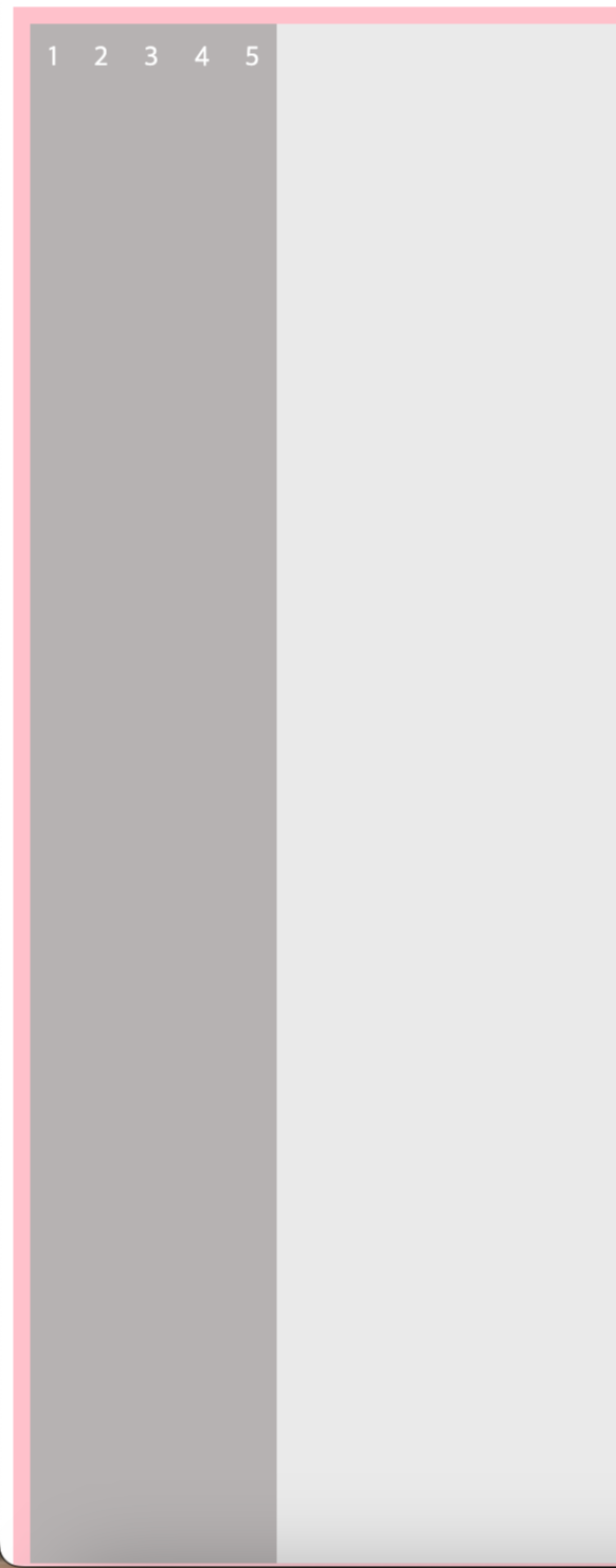
7) align-items 속성
🥑 align-items : 자식 요소가 1개 이거나 줄 바꿈이 필요없을 때
align-items: flex-start - 교차축 시작점에 맞춰 배치
align-items: flex-end - 교차축 끝점에 맞춰 배치
align-items: center - 교차축 중앙에 배치
align-items: stretch - <기본값> 플렉스 항목을 확장해 교차축을 꽉 채움
align-items: baseline - 교차축의 문자 기준선에 맞춰 배치
💡 stretch와 baseline은 크기 지정을 하지 않았을 때 적용 됨!
<head>
    <style>
        section {
            height: 100%;
            box-sizing: border-box;

            display: flex;
            flex-flow: row nowrap;

            align-items: stretch;
        }
    </style>
</head>
<body>
<main>
    <section>
        <article>1</article>
        <article>2</article>
        <article>3</article>
        <article>4</article>
        <article>5</article>
    </section>
</main>
</body>


[ 내용 참고 : IT 학원 강의 및 책 'Do it HTML+CSS+자바스크립트 웹 표준의 정석' ]
'HTML&CSS > CSS' 카테고리의 다른 글
| [CSS] 플렉스 박스 | 크기를 지정하지 않은 경우 속성 적용 결과 ver (0) | 2024.03.26 |
|---|---|
| [CSS] position 속성, z-index (1) | 2024.03.25 |
| [CSS] 목록 스타일, 표 스타일 (1) | 2024.03.23 |
| [CSS] 글꼴 및 텍스트 스타일 지정, 웹 폰트 사용 (0) | 2024.03.23 |
| [CSS] 배경 이미지 지정과 속성 (0) | 2024.03.22 |